


Mis Soles is a brand of artisanal products with roots in Mendoza, Argentina. It specializes in the crafting of jams, olive oil, syrups, and liqueurs.


Despite having loyal customers who consumed their products, they faced many difficulties when it came to positioning their line of liquors in the market. This was inexplicable, considering they were located in front of a bustling square in an affluent area of the city. Attempts were made to lower prices as a purchasing incentive, but it proved to be an ineffective measure. Due to this, their liquors were on the brink of being removed from their catalog.


Street Vision

A comprehensive analysis was conducted, encompassing territory, users, product, and the brand itself to pinpoint the root of the problem and devise a strategy. It was determined that the labels on the liquors lacked the necessary graphic and print quality to compete in a sector renowned for its high competition and quality in the alcoholic beverage industry.
Given the purchasing power of the area, the solution wasn't to lower prices but to make the product more persuasive, eye-catching, and iconic enough to stand out in a saturated market. A label redesign was proposed, not only to increase sales but also to allow for an increase in the selling price of each bottle.
The previous label was designed in black and white, except for the logo, whose yellow color overlaid on the white background made it difficult to see due to the lack of contrast. The illustration appeared muddled due to the ink, rendering it unreadable from a moderate distance. This issue was exacerbated by the low quality of the paper and the Injekt printing method. Visually, it lacked differentiation between flavors, had few elements to set it apart from the competition, and failed to encourage purchase.


Author: Alphonse Mucha

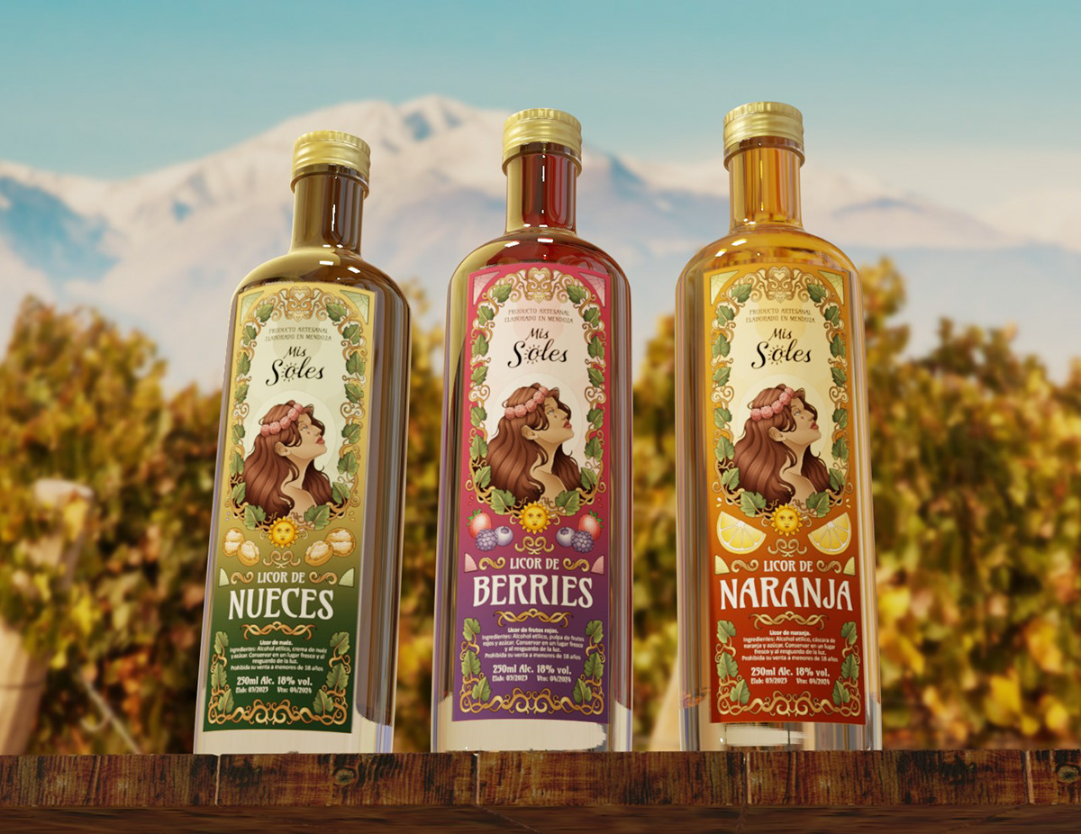
For the new label, an Art Nouveau-inspired style was chosen, enabling the creation of innovative and elegant designs without resorting to rigid minimalism. Its distinctive ornamentations, depiction of the human figure, natural elements, and lavish lettering were well-suited to infuse the label with genuine personality. It's worth noting that all the illustrations were meticulously crafted for this proyect, adding a unique artistic touch. Each flavor is distinguished by its unique color palette, graphic representation, and corresponding denomination, transforming each bottle into a collector's piece of art.


The redesign of the labels was intended to have no significant impact on the budget. To achieve the desired quality while minimizing costs, various methods were employed. One approach was to use Digital Offset printing, which proved to be a cost-effective alternative allowing for a wide range of vibrant colors and precise printing without the need for excessively large orders. Additionally, the rectangular shape of the label was retained, as guillotine cutting is more economical than die-cutting. Finally, all legal and commercial information was consolidated on one side to eliminate the need for a separate back label. Each of these decisions contributed to making the project economically feasible.

Final artwork prepared for digital offset printing.


